
Tableau is a software that greatly enhances our visualization of Big Data and that allows us to extract meaningful Business Intelligence (BI).
To do that Tableau mines through ordinary data sets and turns them into visually powerful stories. With these brave insights, we can spot trends, patterns and anomalies, and make correct forecasts.
Since smart devices are the biggest sources of Big Data, Tableau helps magnify our view of IoT networks.
Why Tableau Is Needed
We cannot make sense of the built-in complexity for huge amounts of data on spreadsheets. This is because of the sheer amount of information out there and a lack of common ground.
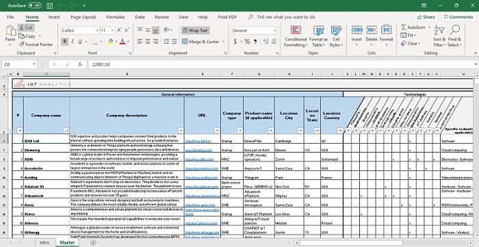
For example, the following Excel contains an online list of more than 350 companies that work in the IoT space. The list contains big names, such as Samsung and Microsoft, as well as smaller companies.
There are hundreds of columns which neatly categorize the specific businesses these companies are in. Smart homes, wearables and semiconductors are a few of the key focus areas.
Furthermore, there are verticals such as retail or healthcare, and technologies such as the cloud or AI. You can see random comments about the future IoT strategies of various companies.
Clearly, analyzing such a wealth of information which may change rapidly is not a very easy task. To make a spot decision, the AI engines of Tableau provide a helping hand.
Analyzing IoT Data with Tableau
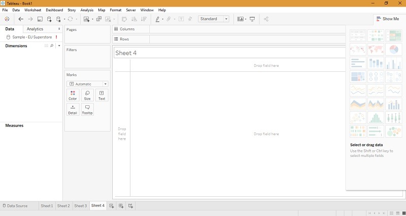
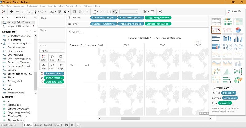
Although it looks plain, Tableau’s dashboard is packed with features at multiple levels. There are so many ways to visualize data including text tables, heat maps, scatter plots, bubbles and maps.
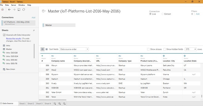
After importing the data into Tableau’s workbook, its AI engine immediately kicks in. Here it offers to clean the data with its intepreter, further creating new datasets based on common purpose values.
For example, the dataset named “Master” contains a list of companies in different geographies and the exact IoT product they have. This makes the data very useful. One can choose not to clean the data for a broader analysis.
Results
In the following sheet the data has been compared for select multiple parameters including “smart cities,” “healthcare,” and “lifestyle” versus “geographies” and “budget.” This kind of sampling has real world applications.
With Tableau, one can ask casual questions and visualize them in the graph, such as:
- What are the most important IoT projects currently being funded based on the exact countries?
- Are some of them related to healthcare, smart cities and lifestyle components?
- Can we highlight the most important IoT trends which have been consistent from the late 1990s to 2016?
- Which companies may have a ready market for IoT sensors?
After we plot the initial geographical maps, it is easy to zoom in to one of the locations for insights. The following insights are for California.
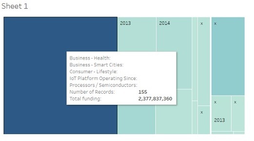
Clearly, we can see that there are 155 companies in the given spaces of healthcare, smart cities and lifestyles with a seed funding worth $2 billion. With this, we can answer the first two questions.
We can also horizontally move from 1996 to 2016 to answer the third question. For more advanced insights, some level of Tableau training is necessary.
The possibilities of visualization are endless. The AI engine keeps learning about the visualizer’s tastes and habits. With each trial, the insights keep becoming fuller.
Conclusion
When the connected devices send so much information via sensors, edge/fog nodes and Low-Power devices (LoRaWAN), understanding this information requires AI help.
Tableau is one of the best data visualization tools to visualize big data. It is not the only one, though. Other leading visual tools – including Qlik View, Fusion Charts and Microsoft Power BI – do the job quite well.
Which is your favorite data analysis tool?


?s")