
We’ve been talking a lot about how the Internet of things can help with the coronavirus pandemic. Some security-minded folks, however, may see it as an invasion of privacy. Smart thermometers are being used to track coronavirus with the belief that the “seasonal illnesses” map is indicating where coronavirus is being pinned down.
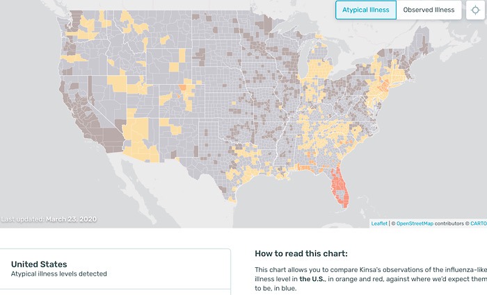
Tracking “Atypical Illness Levels”
It makes sense when you think about it: if a map is showing “atypical” levels of influenza-like illnesses in an area, it’s probably showing coronavirus COVID-19, as there is nothing typical about it.
This data and discussion is being provided by Kinsa, a manufacturer of smart thermometers. They offer on their site a U.S. Health Weather Map to show where seasonal illness that is linked to fever is found. They get their data from the smart thermometers they manufacture and the linked mobile apps.
Kinsa notes that the data shows the illness levels and the degree to which those levers are higher than typical levels. expected at this point in the flu season. It’s their belief that “atypical illness” shown is connected to coronavirus COVID-19.
Kinsa puts a disclaimer on this information, explaining, “We are not stating that this data represents COVID-19 activity. However, we would expect to pick up higher-than-anticipated levels of flu-like symptoms in our data in areas where the pandemic is affecting large numbers of people. Taken together with other data points, we believe this data may be a helpful early indicator of where and how quickly the virus is spreading.”
Analyzing the Data
However, the map doesn’t appear to reflect what we know of the illness so far. The first person in the United States with coronavirus was in Seattle, Washington, and that became the nation’s first “cluster,” spreading to a neighboring county as well. Yet, both show mild observed illness that is zero percent above what is expected for this time of year. It doesn’t seem to reflect what we know.
Another early cluster was in New Rochelle, New York. That county has moderate observed illness that is .931 percent above what is expected. Again, that doesn’t seem as alarming as it should.
The website offers another note: “Due to widespread social distancing, school closures, stay-at-home orders, etc., influenza-related illness levels are dropping in many regions. In some regions (e.g. CA) they’re dropping below the expected range for his time of year — which reduces the level of atypical illness to zero on our map.
To an untrained medical person, it seems this data is offering just that, what is explained above: influenza. Of course there is less flu than normal, we’re staying at home, practicing social distancing, etc. But despite that, COVID-19 is still climbing in number, and this map just doesn’t seem to support that.
This could be good news for those who own smart thermometers, as they didn’t know their data was being plotted on a map to study a pandemic. But in this unexpected time we’re living in, maybe this is seen as doing our part. Certainly, Kinsa was doing that, just looking to see if their data could provide any insight into solving the pandemic.
Image Credit: Atypical Illness Levels and Kinsa Smart Thermometer


